At home with casa.decarlo
Home story starring Tamara from @casa.decarlo
The interior design influencer gives five tips on the subject of kitchen planning.
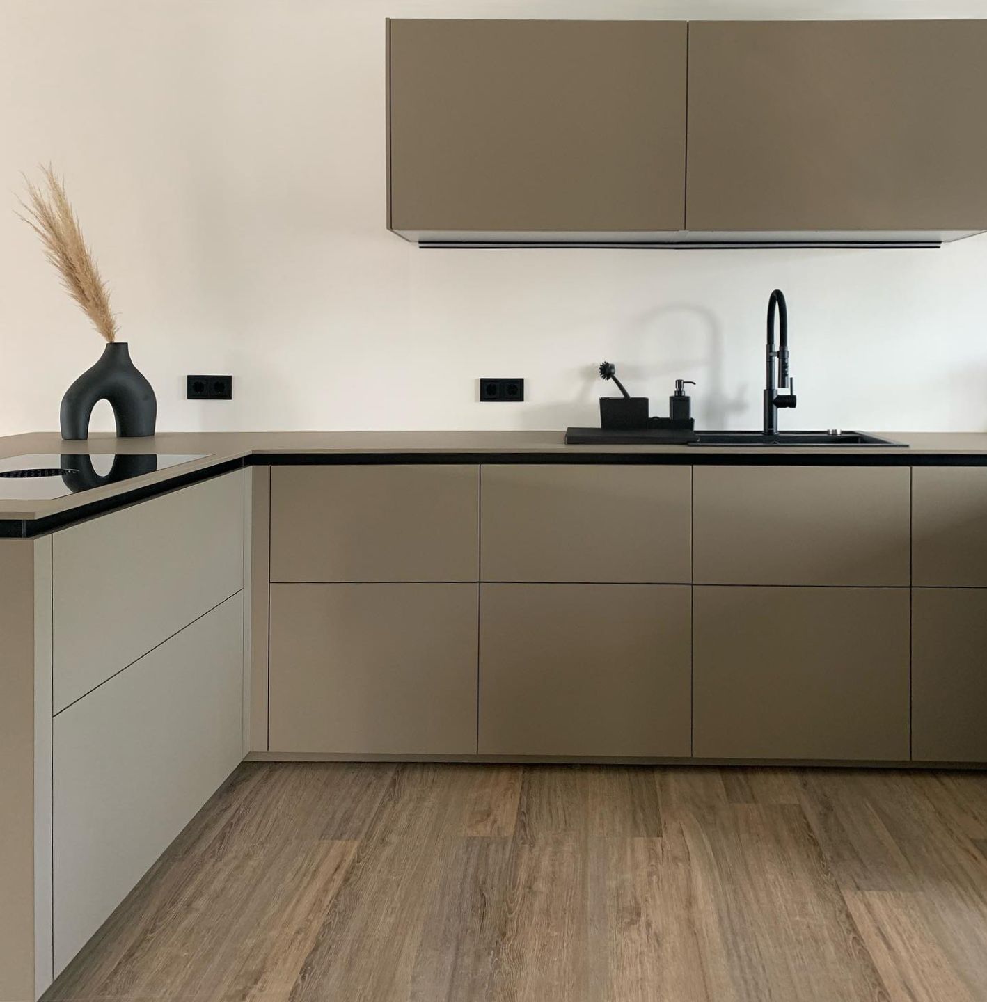
Tamara from @casa.decarlo, a social media channel for interior design with around 22,000 Instagram followers, opted for a next125 kitchen for her new home. She chose the nx510 front in Sahara beige matt velvet AFP, an nx240 tall unit in SensiQ onyx black fine matt AFP and a Systemo worktop in SensiQ Sahara beige fine matt AFP. Today she is giving us an insight into her planning thought process, decision-making criteria and experience with next125.
Creative Makers – kitchen owners
next125 has kicked off the new year with a series of collaboration projects in which next125 kitchen owners tell us about the planning and decision-making behind their next125 kitchen and how they use and enjoy it. They also give a few tips of their own.
They can be seen as Creative Makers who build a bridge between inspiration and imagination and the planning, implementation and use of a next125 kitchen. The next125 brand comes to life thanks to the people who design it, provide inspiration and interact with it: Creative Makers.
#1 First the planning, then the colour
As far as choosing colours is concerned, when planning our kitchen, we simply switched things up and kept our options open for a while. Thanks to the individual planning options with next125, this was not a problem. It gave us the freedom to decide on the perfect shade – Sahara beige – once we had filled in the overall picture with all of the big and little details and already had a clear idea of how the final result would look. For example, we knew from the beginning that we wanted to install sleek, elegant details in onyx black – the built-in kitchen appliances, the sink and the kitchen taps, and the sockets too, which were to stand out against the base colour of the kitchen.
I personally love a minimalist look with a tidy, elegant and calming effect; that’s why a consistent colour design for the unit surfaces and worktop were important. In my mind, in places such as the kitchen where it is impossible to completely avoid accumulating accessories, a seamless colour design really helps to create a calm overall effect.
Whether subtle or bold – the well-thought-out next125 colour concept offers colours to suit every taste. The different materials for fronts and worktops allow you to create a personal living space that is tailored to your needs.
#2 Remain true to the interior style
I love a minimalist interior style. This subtle elegance that I design and decorate my house with should also follow through to the kitchen - especially since the living and dining areas flow into each other and the kitchen is a central part of our living area.
To continue the minimalist appearance in the kitchen, we decided on a TIP-ON opening system for our pull-outs, complemented by grip ledge profiles in a contrasting onyx black to make the overall appearance of the kitchen less monotonous but at the same time keep it subtle and elegant.
I think that this makes the kitchen the perfect setting for wonderful flower arrangements, special vases or pieces of decor that add a touch of colour to the room.
#3 It’s not just looks that matter, but above all practicality
The matt SensiQ worktop won us over right away. Its scratch- and cut-resistant surfaces make it extremely robust and at the same time hygienic and safe for use with foods. As I belong to #teamtidy, I’m a big fan of the anti-finger-print feature of our matt velvet lacquered surfaces. This makes them much easier to clean and makes the odd fingerprint less visible. Something else that makes cleaning easier is the water-repellent SensiQ worktop: this means that spills or water rings from glasses don’t leave stains.
A kitchen should be ...
... be timeless but still something special.
#4 A must: plenty of storage space
This was absolutely essential for me: plenty of storage space in my kitchen is a must. To create a tidy, elegant look, we knew that we had to factor in different options to hide away all of the small kitchen aids, pots and pans.
We first established a clear picture of how much space we needed. Where possible, we tried to plan for tall units as these provide the most storage options. We also chose wall units, which gave us even more possibilities to keep things neat and tidy.
next125 provides the option of equipping drawers and pull-outs with special inserts, such as Flex-Boxes or the Primus organisation system, to meet individual requirements. That way everything has its place and is always close at hand when I need it.
#5 Greater comfort thanks to ergonomic planning
What’s more, the working height and depth of the kitchen units could also be tailored to our needs. This makes food preparation and cooking enjoyable and easy on the body. To create the finished look, it was also important to me that as many appliances as possible were out of sight and so did not disturb the overall effect unnecessarily.
Carcase heights – grids
Ergonomic planning forms the basis of every kitchen. Thanks to the flexibility of next125, carcase heights, plinths and worktops can be individually combined for a customised end result.
Om de keuken naar een nog hoger niveau te tillen, kan ik iedereen aanraden om een huisdier te nemen dat perfect past bij het gekozen kleurconcept – zoals onze Carlo met zijn perfecte combinatie van zwart en saharabeige. =)
- Extra tip, Tamara @casa.decarlo -


